This is the first part of analysis for the usability test I recently conducted, with the purpose to uncover usability flaws of two GNOME applications: Photos and Calendar.
For this part I am focusing on visualizing the results, demographics and talk more about the methodology I used for testing. We will take a closer look on how testers performed on every task given, using a heat map. Hopefully this will create a clear picture of the testing process and help to “get to know” the participants and understand them better!
Ten volunteers participated in the usability test, representing a mix of genders (slightly more men than women) and an age ranges (mostly at age 15 to 25).


All participants were asked about computer usage frequency and the majority said that they use it on daily basis.

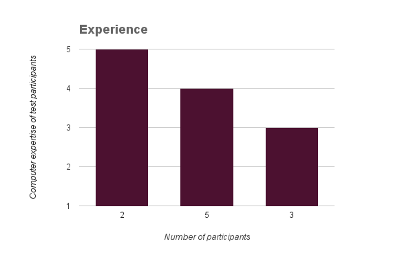
Participants identified their computer expertise by choosing a level between 2-5.
1-I don’t know anything, I never use the computer
2- I don’t know a lot, I am not a frequent user
3- I know some things
4- I am pretty average
5- I am better than most
Most of the participants were not familiar with GNOME. Some of them had heard about it in the past but this was the first time using it, three of them use GNOME daily.
Testers were provided a laptop running GNOME 3.20 on Fedora 24 operating system, without any modifications that could possibly affect the participants overall experience during the test. They executed the test separately, using identical settings. I used Gnome Continuous image running on GNOME Boxes, to test with Calendar. Each participant used a separate guest account that had been pre-loaded with the example files needed to complete the tasks.
Each usability test session started with an introduction:
Thank you for coming today!
Just like Windows is a desktop system and MacOS is a desktop system, GNOME is a free software desktop system. And you’ll be doing a few tasks using GNOME and a few GNOME applications. I’ll give you the tasks one at a time. We aren’t “testing” you. The test is all about the software. If you have problems with part of the test, that’s okay; that’s exactly what we are trying to find. So don’t feel embarrassed if you have problems doing something and please do not feel pressured by time or anything else. If you can’t figure something out, that is perfectly okay and will still provide us with useful information for the test. If you have any questions about the tasks I will try to answer them, but the answers and feedback should come directly from you as much as possible so I will avoid anything that would lead you to a specific choice. Also, I’m going to take notes while you’re doing these tasks. It will help me if you talk out loud when you are doing something, so I can take notes. So if you’re looking for a Print button, just say “I’m looking for a Print button.” And move the mouse to wherever you are looking on the screen, so I can see where you’re looking. It would also be very helpful for me to do a screen-record of the testing process, so that I can go back to that later during my analysis.
After that, participants were presented with 16 scenario tasks which they were expected to complete in 40-50 minutes. All the participants managed to complete the tasks in less than 50 minutes.
Photos:
1. You just got back from your trip to Thailand. You want to show your friends all the pictures that you captured there but you notice that they are all mixed with the other pictures that were previously there. To avoid the confusion you decide to create an album that contains only pictures from your trip and name it “Thailand trip”.
2. As you are showing the pictures of the album you just created, you notice a picture that you’d like to share on your social media accounts. You “favorite” that picture, in order to access it more easily later on.
3.While looking trough all the photos, you notice that two of the photos look very similar, so you decide to delete one of them.
4.After showing your friends all the pictures of the “Thailand trip” album, you revisit your “favorite” picture since you want to edit it before sharing on social media.
5.You start by cropping the picture to make it look smaller.
6.Than you want to play with colors a little bit. You want to make the picture brighter and lower its saturation but leave the contrast as it is.
7.Now you want to enhance your photo. You sharpen it a little bit and leave the denoise as it is.
8.And finally, you choose a filter named “Calistoga” as a final touch.
9.You want to apply these changes, so the photo remains as it is.
10.You really like the way that the picture turned out and you decide to set it as a “Background picture”.
Calendar:
1.You want to have all your work related activities in your calendar but you don’t want them to be mixed with other activities, since you have a lot going on lately. In order to keep your events organized you decide to create a calendar only for work related activities. Name the calendar simply “Work” and make the activities appear in purple color.
2.You have a meeting with your boss today. You want to create an event named “Meeting for work”, the meeting starts at 2:00pm until 4:00pm. Make sure to put it in the “Work” calendar that you created earlier.
3.Set a reminder 10 minutes before the meeting starts, just in case you forget that you have a meeting.
4.You plan to throw a big celebration party for your birthday next year. You want to check what day of the week will your birthday be, while wishing for Friday so everyone can show up! Check the calendar and tell me what day of the week your birthday will be in 2017.
5.You have already created an event named “GUADEC” for the GUADEC
conference you are attending next month but you forgot the exact date. Can you please search for it and then tell me the date.
6.You don’t want to move across different calendars, creating same events multiple times. So, you try to connect this calendar with google calendar (or any other online account you use).
I used Jim Hall’s heat map technique, to summarize my usability test results. I find this to be a great way to see how the users performed on each task. The heat map clarifies how easy or difficult it was for the participant to accomplish a certain task.
- Scenario tasks (from the usability test) are arranged in rows.
- Test participants (for each tester) are arranged in columns.
- The colored blocks represent each tester’s difficulty with each scenario task.
Green blocks represent the ability of the participant to accomplish the tasks with little or no difficulty.
Yellow blocks indicate the tasks that the tester had significant difficulties in accomplishing.
Red blocks indicate that testers experienced extreme difficulty or where testers completed the tasks incorrectly.
Black blocks indicate tasks the tester was unable to complete.

Generally speaking, participants accomplished most of the tasks without difficulties.
Tasks like edit a picture, change the color, enhance, apply a filter on Photos and set an alarm, search for an event on Calendar, seemed to perform really well.
Participants encountered the most difficulties in creating an album in Photos and adding a new calendar, adding a new online account in Calendar. There are two tasks(marked in black) that participants were not able to accomplish, which is a small number considering the number of tasks that were completed successfully.
I ordered the columns starting from beginners(left), to experienced users(right). We can notice the “Cool” rows with lots of green and yellow are dominating the right side of the heat map. This indicates the impact of the previous experience in accomplishing the tasks. Areas that describe the experienced users tasks are more likely to be areas with good usability.
This is a wrap for part 1 of usability test analysis. Next up, I am coming with more details “pulled” from the heat map. What was common between the “cool” rows and why did users find these easy to do? What was common between the “hot” rows? What where the challenges and what went well?
More to come soon!

4 responses to “GNOME Usability Test Results (Part 1)”
Very interesting results! I am excited to see Part 2 of your analysis!
From your heat map, I agree the “hot” rows are ‘Create an album’ (Photos) and ‘Add a new calendar’ and ‘Add an online account’ (Calendar).
Some “warm” rows seem to be ‘Set as a background picture’ (Photos) and ‘Look for a specific date’ (Calendar) – but these “warm” rows are not as problematic as most users experienced no or little difficulty here.
I’d focus on the two “hot” rows you cited. These seem to cause the most issues.
LikeLike
[…] Usability Test Results (Part 1) https://renatagegaj.wordpress.com/2016/08/23/gnome-usability-test-results-part-1/ #gnu […]
LikeLike
Exciting. Thanks for all your efforts so far, Renata (and Jim). I am not surprised that creating an album is the hottest row for Photos. “Horrible” is how I’d describe the album creation UX in Photos. It’s been untouched from the very earliest versions of the application. A year ago we revamped the collections UX in Documents. I hope to do the same for Photos very soon.
Once again, great work!
LikeLiked by 1 person
[…] I am with the last part of analysis🙂 On part 1 I focused more on visualizing the results, demographics and talked more about the methodology I […]
LikeLike